Susan Sontag was a forerunner of theory on looking at photographs, images, and perhaps even fellow human beings. I have been attempting to read her “cannon” and have my own thoughts on “looking” at one’s environment, and relationship to images at large. That being said – I obviously find Sontag extremely provocative and recommend reading her work (most people start with “On Photography” but I recommend “Regarding the Pain of Others” in light of the state of our world.)
 Tangentially I have long been considering the over-saturation, and the extreme minimalism or “de-saturation” that both vie for our attention in a global, media-driven society and the connectivity of advertising, and internet innovation.
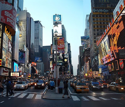
Above is a found photo of Times Square. A couple things on this land mark:
1) I see it every day. It doesn’t get any smaller when I try to ignore it. Those instances when I do glance a block up Broadway it will still shock and awe! It embodies the “crossroads of the world” impressiveness now just as it did in concept in 1904 when One Times Square was originally built.
2) But what was really the intention of the builders of this cross-section? It’s a lot of advertising. Impressive in immensity and electricity, but what of that? There has been history and romance created and recreated here, but I wonder if it has begun to lie about our culture rather than reflect it.
3) Do we want to be a part of a culture that says “SHOP AT TARGET, WORLD!!!” *but you’ll need to travel to downtown brooklyn, or shop online and pay for shipping; and “LOOK AT HOW COOL OUR PRESIDENT LOOKS IN THIS COAT!!! DON’T YOU WANT ONE TOO??”?
Is this what we want from the icon of this city – from an icon of our Nation?
 If Times Square SHOUTS then Mac computers have learned to be the consumer-whisperers. Soothing our eyes and our high-stress, high-maintenance lives with simple lines and usability. Granted, Apple computers are advertised more ubiquitously than any other products that I can think of off the top of my head. However, they have provided a synchronization that we have desired for this age.
Let’s look at some ups and downs to this minimalism…iTunes for example…
 Great for organizing and making music fans of even the passive listener. However – I remember in 2004, walking through Amoeba wondering how long it would take before people had completely forgotten about the Album, more specifically the Album Art! I am a culprit of this very thing. I own albums that have been ripped and burned, that I have no idea what artwork it may correspond to. Some times I still am unsure of track titles due to a lackadaisical approach to entering data into it’s base. In fact, sometimes I am really taken off-guard by seeing album art when I do observe those relationships.
Recently, while perusing a New Jersey shop that sells vinyl, cds, and dvds that would wet anyone’s pallet to start collecting again, when I came across one album that particularly caught my eye. The painting on the cover -I recognized. The album it was associated with – I also had heard! But that relationship was previously unknown to me. It informed my understanding of both the music and the visual art instantly in a positive manner.
I could see this going one of at least two ways. On the one hand – you can be manipulated into liking music based on the look/feel of an album cover, promotional poster, or music video, even if it is not good, or not to your taste. But again, on the flip side – those things could be a risk that turns off some fans. I, personally hope that visual artists and musicians continue to respect eachother’s talent and work together, but my actions have not really been supportive.
The image below is one that would have probably turned me off to the music. I have seen this image on several top 10 album blog posts and am not a fan of the image. But you decide: Do you think visual marketing is a problem or a “pro”? Do you spend energy trying to ignore it or do you enjoy and revel in it’s reflection of our popular-culture? Do you wish commercials and adds would tone it down or elevate beauty in a new way? I have no concrete answers – only vague questions.
